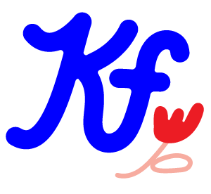
I love Jessica Hische’s work. Her style is very calculated and pristinely done. She is able to create perfection with her lettering. It’s almost robotic and often I wonder how it’s even possible to make something so clean! Often times I prefer hand-lettered type that has a bit of a human element to it but I love the curves of her lettering, especially in her popular font, Buttermilk. I thought I would do a type drawing based on that font for type tuesday this week. It’s always fun to study other fonts and draw them out to get the feel of the shapes in my hand. I feel like it helps me add to my arsenal of ideas when I do my own lettering.


yummy!